2012年3月20日星期二

Chinese Contemporary’s Achilles Heel


After disappointing sales for Bonham’s in Hong Kong, the auctions held by Poly International Auction Company in Beijing has impressed even the duopoly of Sotheby’s and Christies. The FT articleInto the Void by Natasha Degen reported that Poly’s last auction was a success with the 80% Chinese and 10% Western patrons bidding on the highest quality works seen together in the auction market.
The art market has curiously become important inChina which experts argue is due to the absence of an established museum infrastructure. Chinese museums do not have high curatorial standards and rarely exhibit contemporary art. “Right now there’s a void, so the galleries and the auction companies have naturally filled that void,” said Beijing dealer Meg Maggio. “It’s like we’re missing the third point on the triangle.”
American collector of Chinese Contemporary and owner of 210 works said the shortage of important exhibitions in China, and in the West, was Chinese contemporary art’s “Achilles heel.” “There’s not a good conceptual understanding of what the art’s all about,” says Logan. “Everybody can quote the prices but there’s not a real thorough understanding of why this art is important and where it fits into the total scheme of things.”
Beijing has been developing to correct this void of knowledge which is affecting new collectors, wanting to own Chinese Contemporary. The Ullens Centre for Contemporary Art is opening this fall, the Central Academy of Art’s Museum of Contemporary Art is under construction, there is also the Three Shadows Photography Art Centre and The Poly Group is restructuring their art museum of antiquities to include Contemporary Art.
Predictions are that the new museums and serious contemporary art spaces will divert attention away from the auctions, or private/commercial sector, to curators and critics for validation.
20070408032114668.jpg
Wu Guanzhong, Ancient City of Jiaohe (1981)
Sold to a Singaporean Chinese for a record ¥37 million or $4.9 million at Poly

2012年3月11日星期日

Wystawa. Wschód spotyka Zachód


Na wystawie w galerii pierwsze Piętro będzie można zobaczyć prace Lu Youyou, artysty urodzonego w Chinach, który po zgłębieniu tradycyjnej sztuki swojego kraju inspiracji zaczął szukać w Europie.


Lu Youyou urodził się w Pekinie (Chiny) w 1980 roku. Zajmuje się głównie malarstwem w technice olejnej na płótnie, lecz sięga także do innych technik i dziedzin sztuki, takich jak rysunek, kolaż, asamblaż czy instalacja fotografia. Korzystając z wielowiekowej tradycji swojego państwa, chętnie tworzy kompozycje z użyciem tuszu. Ponadto polem jego artystycznej działalności jest fotografia.

Po zgłębieniu technik tradycyjnego malarstwa chińskiego Lu Youyou podjął decyzję o chęci zapoznania się z europejskim malarstwem olejnym. Tak narodził się pomysł wyjazdu do Europy, aby mieć możliwość bezpośredniego obcowania z tutejszą sztuką. Wybór padł na Polskę, a zadecydowała o tym fascynacja... filmami Krzysztofa Kieślowskiego.

Na wystawie "Rytm Zen" prezentowane są prace będące owocem rozmyślań artysty na temat dotyczący Zen. To system filozoficzno-religijny będący połączeniem wybranych idei taoistycznych z niektórymi elementami buddyzmu. "Zen, który oznacza medytację, jest rodzajem praktyki mającej zbliżyć twórcę do oświecenia. Rytm praktyk malarskich w przypadku Lu Youyou jest próbą odnalezienia sensu Zen, dlatego artysta stawia w swojej twórczości wiele pytań mających mu w tym pomóc" - można przeczytać w zaproszeniu na wystawę w galerii ZPAP Pierwsze Piętro. Nie przypadkowo motywem łączącym znakomitą większość prac artysty jest okrąg, symbol chyba najważniejszy w Zen. Artysta szuka w nim jednak wartości rozpoznawalnych nie tylko we wschodnim kręgu kulturowym. Inspiracją dla pozostałych dzieł był natomiast starożytny chiński traktat filozoficzny "Prawdziwa księga południowego kwiatu".

2012年2月28日星期二

Renée Van Halm’s Cross-Cutting/Inside Out is charged with wonderful contradictions


Renée Van Halm: Cross-Cutting/Inside Out
At the Burnaby Art Gallery until April 8
Walk into the main floor exhibition space of the Burnaby Art Gallery and you are confronted with an image of a starkly modernist interior. A gridded wall of glass casts light and shadow across the bare floor and onto a Le Corbusier chair, all stiff black leather and shiny chrome. A telescope sits in one corner, and a sleek floor lamp, pared down to a few militarily efficient lines, occupies the other. Based on a still from the 1986 film 9½ Weeks, this image has been purged of its human occupants, stripped to its modernist bones. It makes an aggressive and indeed erotic statement about style while, at the same time, eliminating the individual who put that statement together. Something of his story, however, is telegraphed to us by the space he might have called home. Something of the film’s intention is conveyed, too, along with the design tropes of a Hollywood idea of America.
Renée Van Halm’s survey exhibition, Cross-Cutting/Inside Out, is charged with wonderful contradictions. A big show of mostly small works, it addresses the ways we construct architecture and architecture constructs us. The built environment and its furnishings, Van Halm’s art reveals, express cultural values and at the same time impose them, defining the ways we occupy, and interact within, a given space. To a lesser extent, Van Halm also deals with the relationship between buildings and the landscape beyond.
Her art takes on presence and absence, private and public, intimacy and grandeur, modernism, pre-modernism, and postmodernism, all in a manner that is gorgeously painterly and rigorously critical. The sources of Van Halm’s imagery range from early Renaissance paintings (as in Study for Annunciation) to contemporary real-estate ads (9,760 SF., 3590 Osler), and from interior design publications (Bedroom Scene/Marcel) to her own photographs and collages (Pearls).
Smartly curated by Sophie Brodovitch, the exhibition is a mid-career retrospective of Van Halm’s architecturally focused works on paper, created between 1979 and 2011. Significantly, it also includes an architectural sculpture produced in 1993. TitledQuotation (1924-25), the sculpture reproduces an interior corner of the Schroeder House, an early modernist residence in Utrecht, designed by Gerritt Rietveld. Its presence here evokes the modernist principles which are the foundation of its design (including elements of transparency—inviting the outside in), but also provokes a dialogue with the space in which it is now exhibited.
As Brodovitch writes in the exhibition catalogue, the work “exposes the extent to which the experience of architecture is mediated and framed by historical and social references”. Visitors to the gallery may peer through the windows of the sculpture as a way of apprehending the two-dimensional art around it and the three-dimensional world beyond.
Best known for her oil paintings on canvas and her stage-set-like sculptures of painted wood (of which Quotation is one), Van Halm reveals equal technical and analytical facility through her gouache and mixed-media drawings on paper and her digital and handmade collages. As with her larger-scale art, her works on paper speak to the time she has spent living, working, teaching, and intently looking in both Vancouver and Toronto, and also to her wide travels, including an extended period spent in Berlin. Among her architectural subjects are museums, galleries, apartment buildings, office buildings, retail outlets, and even bus exchanges, from Tokyo to Madrid. “I’m an archi-tourist,” Van Halm said at a recent media preview at the BAG. “I’m a looker at trends.”
The major trend she explores here is mid-century modernist architecture, along with the furnishings and fixtures associated with it. As with much contemporary art, her work critiques modernist ideals, such as the belief that good design betters the everyday lives of people. A series of gouache drawings of classic modernist interiors causes us to think about the homes and furniture designed by the likes of Mies Van der Rohe, Le Corbusier, Alvar Aalto, Marcel Breuer, and Buckminster Fuller—and whether they actually enhanced the lives of the many or the prestige of a few.
In her Living Room Scenes and Design Interiors, Van Halm presents us not only with domestic rooms distant in time and place but also with those close at hand. Among these works are allusions to her husband and daughter, as well as to her friend and colleague, the distinguished Vancouver painter Gordon Smith. As depicted by Van Halm, Smith’s house, designed by the late Arthur Erickson and bedecked with classic modernist chairs and sofa (the real things, not the knock-offs), brings the modernist dream forward to this time and place. Whether that dream will continue to endure, well, perhaps we should ask Smith.

2012年1月25日星期三

The New Visual Art: An Exploration of Movement


Claire Elizabeth Barratt, director of Cilla Vee Life Arts, has produced a multiple-video experience that explores the creative elements of dance and movement. The exhibition can be seen and experienced at the Flood Gallery in Phil Mechanic Studios, 109 Roberts Street in the River Arts District, through the end of the month.
“Dance is the New Visual Art” is an installation of video pieces, each created specifically for the camera. The result is visual artistry, and not a documentation of a dance performance.
The videos are played simultaneously and continuously, some projected onto screens and others displayed on monitors.
The combination of screens and monitors takes on sculptural forms created by fabric and paper in white and black. These forms serve not only as screens on which to display the videos, but also design the shape of the space, creating a complete environment for the viewer. Visitors to the exhibit can use headphones to hear the sounds related to each piece.
Claire created all the videos in collaboration with numerous artists from a variety of disciplines. “Sallimone,” for example, is a short, abstract art video produced with two local Asheville artists (composer Kimathi Moore and videographer Charles Elmer). Another piece, “Silver,” is a movement meditation with bowed gong music by Japanese percussionist Tatsuya Nakatani and shot by New York/Jamaican video artist Randy F Simon.

Creative Spotlight: Photographer Jenna Kraczek


I’m trying to decide if the phrase “contemporary old school” is a clever oxymoron or not. It’s the phrase that struck me when I started interviewing Jenna Kraczek about her stunning and unique photography. Stylistically Kraczek has managed to veer away from the pack by putting a modern-day spin on classic glamour photography. Think George Hurrell from the forties combined with a little Herb Ritts and splash of Albert Watson. The blend is effective, compelling and shocking considering that Kraczek has only been shooting for a few years. When I sat down with her for this article, I discovered that her road to being a photographer was a more of a mythic journey than a walk in the garden. It all started with some paper and a charcoal.
Kraczek’s introduction to the visual arts started with her mother who was an artist. It was the exposure to her mother’s work at a young age that inspired her to pursue drawing and painting in college. Unknown to her at the time, Kraczek’s embrace of charcoal on paper as her favorite medium was heavily influenced by her love of black and white photography. Especially images with simple composition and pronounced light and shadow.
After Kraczek graduated from college with her art degree, she had to find a career path that would enable her to make a living quickly. Jenna’s attraction to glamour led her to beauty school which could get her working soon after she finished the program. Once again she didn’t realize that she was pursuing yet another path that was one of the parts of the whole of her photography calling.
Because of her very young exposure to painting, Kraczek excelled at color theory and trained to be a colorist. Her last year in beauty school she was part of hair competition in which she also did the makeup on the models. Out of nowhere she ended up winning an award for her makeup and not the hair. For Kraczek it was a wake up call. She loved doing makeup.
As she planned a course to makeup school, she also constantly practiced the craft. Weddings, editorial, short films, some-budget projects, no-budget projects, she didn’t care, she just wanted to practice her passion for painting faces.
Eventually her need to work as a makeup artist outweighed the frequency of opportunities that were available in which she could be highly creative. Kraczek was working with “Model Mayhem” photographers. Not surpassingly the work she was asked to do was pedestrian in concept, or the photography was so dreadful that it failed to showcase her work. So she opted to practice her concepts herself and shoot her own pictures to record the work. It was one of those epic moments like when you see a lighting strike, or the green flash right before the sun dips below the horizon.
Using herself as a model, a few spotlights from Office Depot, and a point-and-shoot camera, Kraczek had come to the end of a journey and found that photography was her true passion. Or as she describes it “her vice.” She began shooting friends, neighbors, and eventually models. Of course doing her own makeup and hair.
As her portfolio started bulking up she began getting noticed. First it was a few small projects, and then a few editorial spreads. Her arrival as a pro came recently when she started getting calls from Hollywood to bid on jobs that engaged her specific style. Yes, there is a reason I’m being vague. The projects are under the hush hush of NDAs at the moment.
Kraczek’s work is extraordinary to look at, not only for its aesthetic beauty, but also for inspiration. Her site is one that I have bookmarked, and check in with often just to see what she’s conjured up lately.
Jenna Kraczek’s career reads like an epic journey where the hero goes through life picking up the required skills that she’ll need to pursue her ultimate destiny. Ironically, in Kraczek’s case, it’s the destiny she would have never discovered had she not travelled the odyssey that she did.
More of Jenna Kraczek’s work can be seen in her site Jenna Kraczek Photography.

fb faces


fbFaces
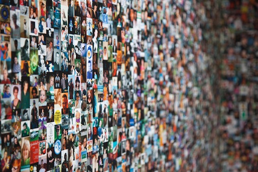
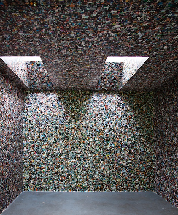
“fbFaces“ is a project by Joern Roeder and Jonathan Pirnay, who study New Media at the University of Visual Arts and Design Kassel, Germany. The project deals with the issue of data accessibility on the Internet; a topic that is gaining more and more attention – especially in our times of privacy protection and social networks. ”On the one hand “Internet giants” like Google are coming under criticism for collecting any unsolicited information accessible, on the other hand it’s surprising how many intimacies we reveal voluntarily, especially in social networks like Facebook.” Read on for more.
____
____
“fbFaces” is a Facebook crawler, built using JavaScript & PHP, that starts at the public profile of any fb-user, saving profile image, Facebook-ID and name, and afterwards continuing its way to the public profiles of the user’s friends. And so on…” -Joern and Jonathan
____
____
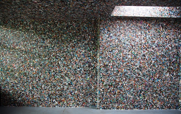
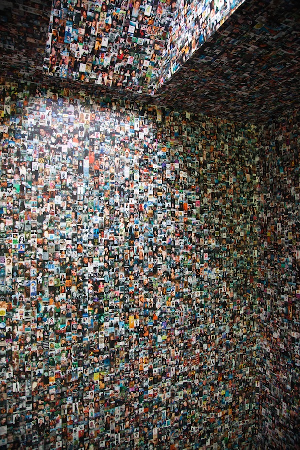
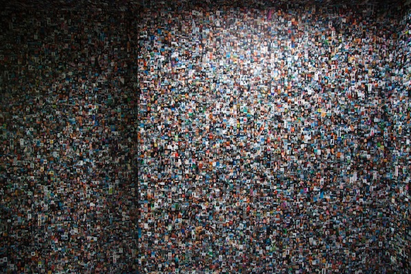
An unimaginable flood of images with self-projection as its only purpose. 100,000 of these profile images were used (via Processing) to print a wallpaper for an entire room.” Joern and Jonathan
____
____
fbFaces is an attempt to visualize the incredible amount of data and images that we are daily overwhelmed by, so that we can neither realize our own selectivity nor consider the amount of data perceived.” -Joern and Jonathan
____
____
The wallpaper transforms the room itself into a flood of information. It surrounds us, cannot be estimated from distance; details can only be caught through determined selection. But then they vanish again – in a cloud of information.” -Joern and Jonathan
____
SO Note: You can (kind of, but not really) find more on the artists by visiting Joern Roeder’s hidden card, and Jonathan Pirnay’s not at all hidden card. Thanks toTriangulation for the via.

Reimagining a Masterpiece


What would you do to improve on the Mona Lisa? Our friends at Booooooom!, the Vancouver-based art blog, are asking photographers to flex their creative muscles by remaking classic works of art. A sampling of the amazing results from the Remake project—modernizing paintings by Rembrandt, Ingres, van Gogh, Lichtenstein, and others—follows.
Grande Odalisque remake 
Above: Grande Odalisque remake, by Craig White 
Grande Odalisque, by Jean Auguste Dominique Ingres 
Above: Grande Odalisque, by Jean Auguste Dominique Ingres 
Ohhh...Alright..., remake 
Above: Ohhh…Alright… remakeby Emily Kiel 
Ohhh…Alright…, Lichtenstein 
Above: Ohhh…Alright…, by Roy Lichtenstein 
The Anatomy Lesson of Dr. Nicolaes Tulp, remake 
Above: The Anatomy Lesson of Dr. Nicolaes Tulp remake, by Bruna Pelissari 
The Anatomy Lesson of Dr. Nicolaes Tulp, Rembrandt 
Above: The Anatomy Lesson of Dr. Nicolaes Tulp, by Rembrandt 
Self Portrait 1889 remake 
Above: Self Portrait 1889 remake, by Seth Johnson 
Self Portrait 1889, van Gogh 
Above: Self Portrait 1889, by Vincent van Gogh 
Gabrielle d’Estrées et une de ses soeurs remake 
Above: Gabrielle d’Estrées et une de ses soeurs remake, by Emile Barret 
Gabrielle d’Estrées et une de ses soeurs, Unkown 
Above: Gabrielle d’Estrées et une de ses soeurs, by unkown artist 
Check out the Remake project website for more iconic works, redefined.
Source: Booooooom! 
Images courtesy of Booooooom! 


Read more: http://www.utne.com/The-Sweet-Pursuit/Reimagining-a-Masterpiece-Remake-Project.aspx#ixzz1kSdOjZgD